
背景:
公司始终具有交互式视觉演练过程。近日,在一次项目演练中,UI小妹强调,项目的布局不符合公司的视觉规范。什么?
而这些操作呢?我是情绪化,但我仍然必须改变它。
首先,我们来看看UI小妹妹所谓的布局规格是什么。
具体来说,
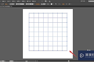
表单项根据屏幕大小动态显示,当屏幕大于1280时,显示2列,列宽为24px,左右对齐。当屏幕小于1280时,显示3列,宽度也是24px,左右对齐,如右图所示
1280屏幕宽度
小于1280屏幕宽度
解决方案 1:使用 elementui 网格布局
看起来挺简单的,项目中使用的组件库主要是基于 elementui 二次打包的,所以第一次想到使用网格布局,但是,重建起来没那么简单。让我们看一下此页面上组件的布局:
也就是说,每个页面引入 pageLayout.vue 公共组件,页面写入 el-form 来替换 pageLayout 插孔。出于这个原因,如果我想使用元素 UI 网格布局,我必须在每个页面上放置一层 el-row/el-col,在 el-form-item 之外,Nima,并考虑大量的工作,所以解决方案一,PASS。
解决方案 2:使用 CSSgrid 布局通过样式控制整体
演示代码如下:
<!DOCTYPE html>
<html lang="en">
<head>
    <meta charset="UTF-8">
    <meta http-equiv="X-UA-Compatible" content="IE=edge">
    <meta name="viewport" content="width=device-width, initial-scale=1.0">
    <title>Document</title>
    <style>
        body{
            margin: 0;
            padding: 0;
            background-color: pink;
        }
        .container{
            width: 100%;
        }
        .container-left{
            width: 200px;
            height: 700px;
            margin-right: 10px;
            float: left;
            background-color: yellow;
        }
        .container-right{
            margin-left: 210px;
            height: 700px;
            background-color: skyblue;
            padding: 20px;
        }
        .page-layout{
            border: 2px dashed red;
            display: flex;
            flex-wrap: wrap;
            gap: 24px;
        }
        .box{
            width: 200px;
            height: 100px;
            background-color: plum;
        }
    </style>
</head>
<body>
    <div class="container">
        <div class="container-left"></div>
        <div class="container-right">
            <h2>模块1</h2>
            <div class="page-layout">
                <div class="box">1</div>
                <div class="box">2</div>
                <div class="box">3</div>
                <div class="box">4</div>
                <div class="box">5</div>
                <div class="box">6</div>
                <div class="box">7</div>
                <div class="box">8</div>
                <div class="box">9</div>
            </div>
        </div>
    </div>
</body>
</html>
演示功效:
推论:
解决方案3:使用网格布局+响应式组合控制,以达到最终功效
在代码上:
<!DOCTYPE html>
<html lang="en">
<head>
    <meta charset="UTF-8">
    <meta http-equiv="X-UA-Compatible" content="IE=edge">
    <meta name="viewport" content="width=device-width, initial-scale=1.0">
    <title>Document</title>
    <style>
        body{
            margin: 0;
            padding: 0;
            background-color: pink;
            min-width: 992px;
        }
        .container{
            width: 100%;
        }
        .container-left{
            width: 200px;
            height: 700px;
            margin-right: 10px;
            float: left;
            background-color: yellow;
        }
        .container-right{
            margin-left: 210px;
            height: 700px;
            background-color: skyblue;
            padding: 20px;
        }
        .page-layout{
            border: 2px dashed red;
            display: flex;
            flex-wrap: wrap;
        }
        .box{
            width: calc(33.33% - 16px);
            height: 100px;
            background-color: plum;
            margin-bottom: 24px;
            margin-right: 24px;
            box-sizing: border-box;
        }
        .box:nth-child(3n){
            margin-right: 0;
        }
        /* 响应式开始 我这里使用的是小屏电脑,因此最大宽度使用的是PC宽度,项目中是1280px*/
        @media screen and (max-width: 992px) {
            .box{
            width: calc(50% - 12px);
            height: 100px;
            background-color: blue;
            margin-right: 0;
            margin-bottom: 24px;
            box-sizing: border-box;
            }
            .box:nth-child(2n){
            margin-left: 24px;
        }
        }
    </style>
</head>
<body>
    <div class="container">
        <div class="container-left"></div>
        <div class="container-right">
            <h2>标题</h2>
            <div class="page-layout">
                <div class="box">1</div>
                <div class="box">2</div>
                <div class="box">3</div>
                <div class="box">4</div>
                <div class="box">5</div>
                <div class="box">6</div>
                <div class="box">7</div>
                <div class="box">8</div>
                <div class="box">9</div>
            </div>
        </div>
    </div>
</body>
</html>
演示功效
通过第三种方案,在页面布局组件中由CSS控制el-form-item的长度css3 对称,实现批量修改,最终满足演练的要求
遇见坑:
但是在更改时,还是存在一些陷阱,例如,一些 el-form 项由 v-show 控制css3 对称,导致第 n 个子元素控制的子元素没有相应的视图显示,因此尝试使用 v-if 来控制元素是否显示。
